

Mental health and stress are some of the top concerns for young people today. Life is messy, and in the chaos of our day-to-day, we often forget to take care of ourselves.
As we return to our lives post-lockdowns, the way we connect with others, our communities, and even ourselves has changed.
Reaching out for help can be a struggle, especially if we don't know where to start.
As we do our best to juggle work, studies and health in an ever-changing world, sometimes we just need a friend to help us through it.
The Problem


Who is this for?
How intersecting mental health concerns impact these ideas
Any limitations people face when trying to access support
Common concerns around mental health for young people today
The target users for this app are young adults.
Adolescence and early adulthood are critical years for timely mental health intervention and support.
The main ideas and concerns I wanted to understand in this process were:
The Personas

These are the people who are already focusing their energy on self-improvement. They have already started building healthy habits and are just looking to continue on their journey.
These users may not need as much motivation as the others, but have other needs for the app.
The self-starter
Persona 04: Noah

These are the people who are all about work. Focusing on their career may mean that they put their internal needs aside, resulting in burnout.
These users would want quick or enticing solutions so they can incorporate well-being into their busy schedule.
The corporate climber
Persona 03: Tina

These are the people who are focused on completing their studies. Tests, reports, and deadlines are the main things on their mind.
These users may have a more flexible daily structure, but still need help with organising their time. They may also need reminders to prioritise their physical and mental health.
The dedicated student
Persona 02: Anthony

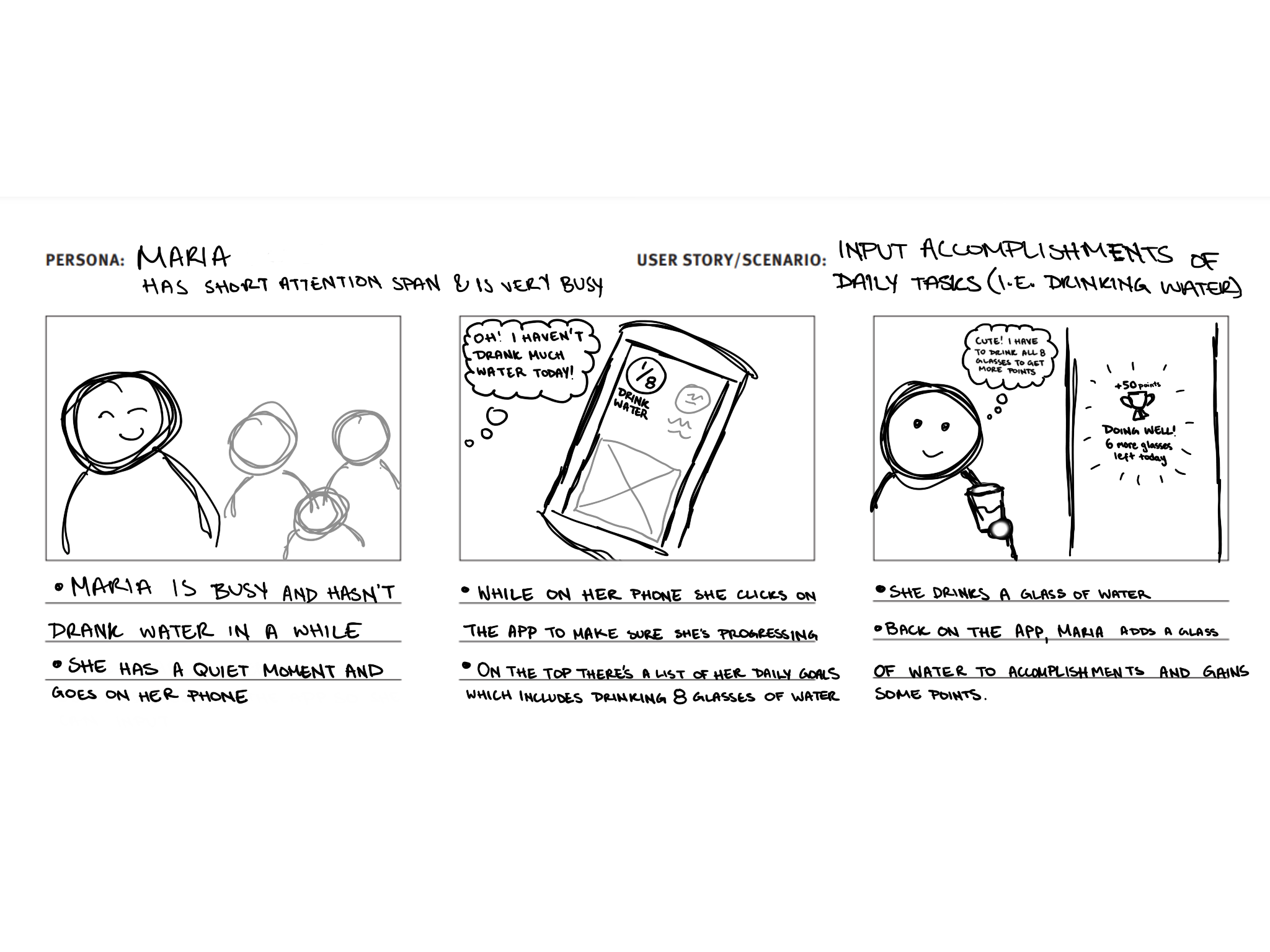
These are the people who are doing it all. They do their best to juggle work, studies, and social obligations. However, when it comes time to take care of themselves, they may forget to.
These users may require motivation and encouragement to set aside "me time".
The juggler
Persona 01: Maria


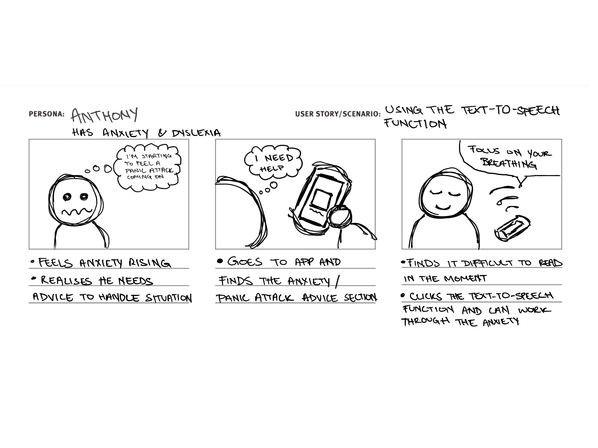
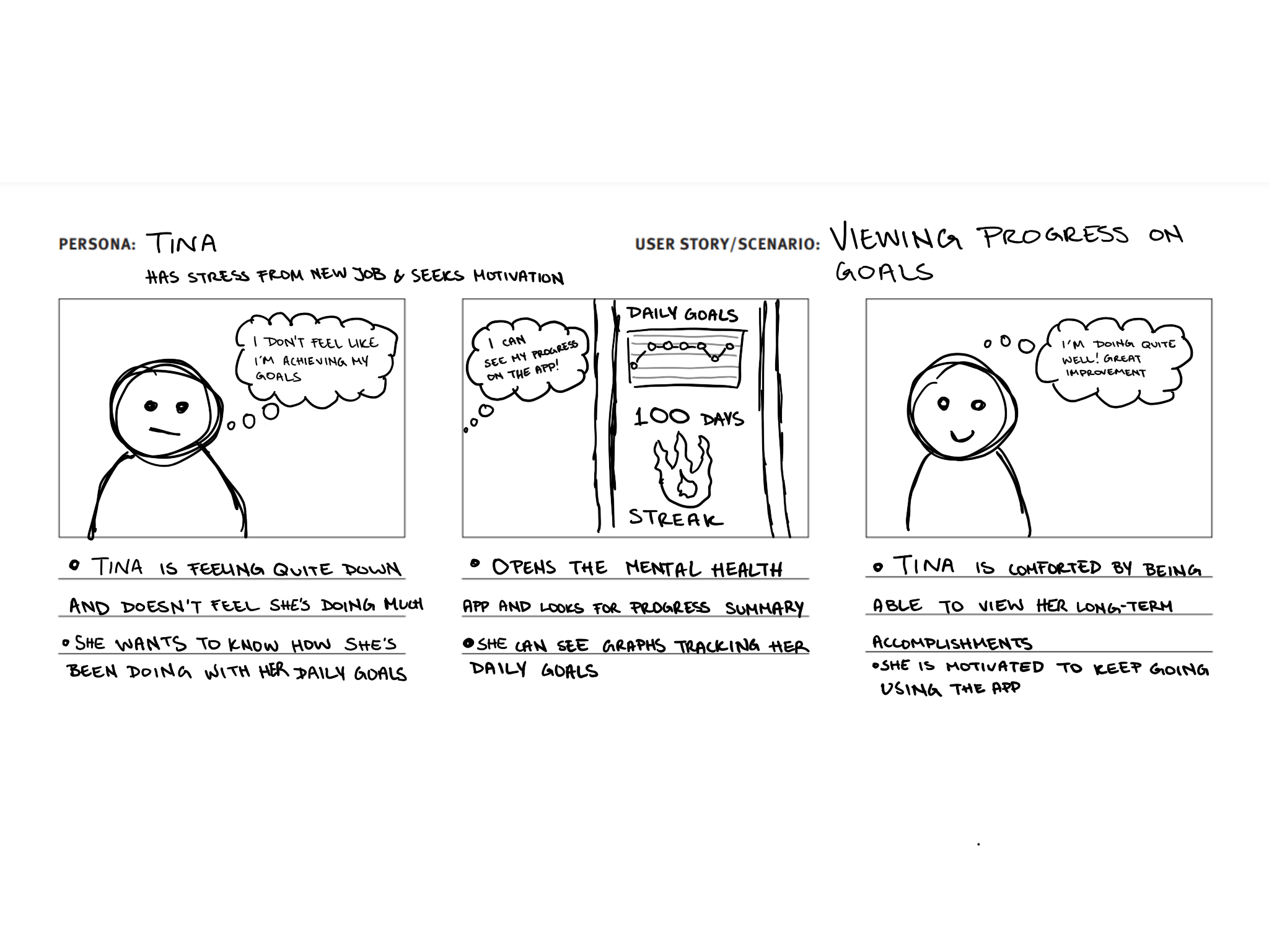
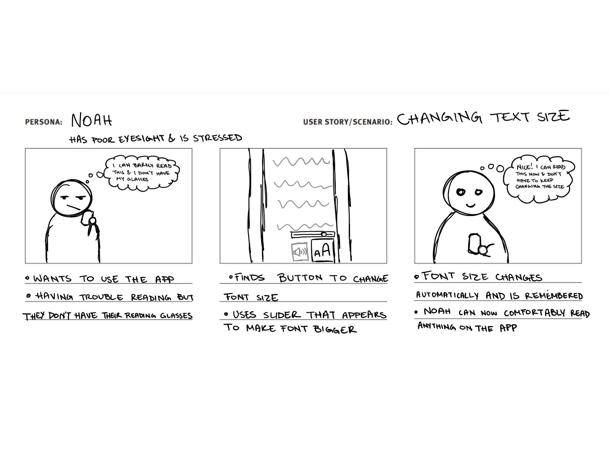
Storyboarding
Understanding user needs
It is clear that different users have different perspectives on mental health, but they all have one overarching need: to feel supported in a way that is meaningful to them.
This lead me to explore what support might look like...
Why a mobile app?

For this concept to work, we needed a place you can turn to for help, general advice, and encouragement. When analysing the frustrations of our target users, two main themes emerged: users wanted visibility and accessibility.
That's how Brain Buddy was born! Making this a mobile app meant that help would always be accessible, right in your pocket.
The act of reaching out for help is a struggle in itself, so I wanted to consider features that would reduce the friction faced when accessing support.
Creating a pocket friend
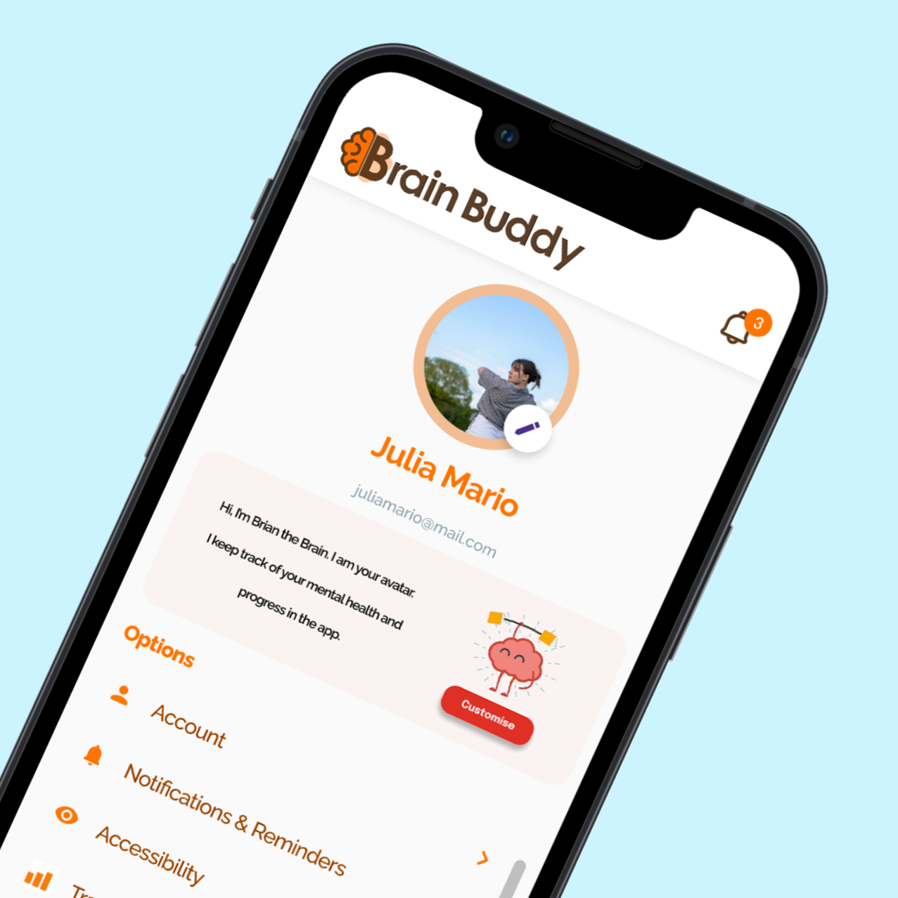
Brain Buddy aims to be a friend to help you keep track of your mental health goals.
When thinking about branding, the word that kept coming up was playfulness. This app will gamify the idea of self-care and self-improvement.
We want to create an experience that in itself sparks joy and excitement to complete tasks. To do this, we knew we had to strike a balance of bright, enticing visuals without overwhelming the user with a busy screen.
The Brand
Colour Palette

Type


Logo
Adding the brand colours improved the logo I added the other lobe in the background behind the B to help blend the two halves together and make it feel complete.

06
Final logo
With the simpler design, I only used one lobe ('Brain'), and one B ('Buddy'). This was feeling much better, but it felt like there was still something missing...

05
Improve design
I realised I needed to go simple. If the icon was too intricate, the detail would be lost when it's used on a small phone screen. So I started seeing what it might look like if I only used one B as a lobe.

04
Keep it simple

I began experimenting digitally and tried to add the B's into the brain's wrinkles. This idea wasn't quite working, so it was back to the drawing board!
03
First iteration
Having the initials ('BB') reflected resembled two lobes of a brain to me, so I played around with this concept. Using just the letters was looking more like a butterfly, so I knew I had to add some detail.


02
First concept

I started the process of logo design by putting pen to paper. I made sure to note down some key words as inspiration and started playing around with ideas.
01
Brainstorm
Logo design process
Prototypes
Meaningful and seamless implementation of accessibility features
Useful visualisation of ever-growing personal data, for users to track their goals
Simple yet enticing interface and user flows, for ease of use
When building out the wireframes and prototypes, there were both functional and non-functional requirements that needed to be met to keep the users happy:
Key Functionality
Visibility

Track daily habits
Visibility

See your progress
Accessibility

Listen to articles
Accessibility

Adjust text size
For my first iteration, I created low-fidelity wireframes to explore a couple of ideas for incorporating this functionality into the app.
Using these paper prototypes, I went to validate these ideas with users. Over a few workshops, we discussed and iterated on the original ideas and added frequently requested features.
Talking through the designs and the thought processes users have while using screens added more insight into the frustrations they face and how we might address these gaps when finalising the designs.
Testing ideas
Final designs
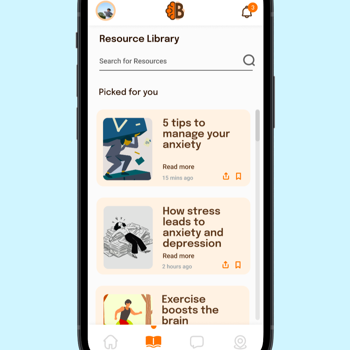
Resource library changes: the main change here was to do with how users can change the text size. Instead of using a slider, I decided to use buttons as they would be easier to use, especially for users with difficulty with their fine motor skills.
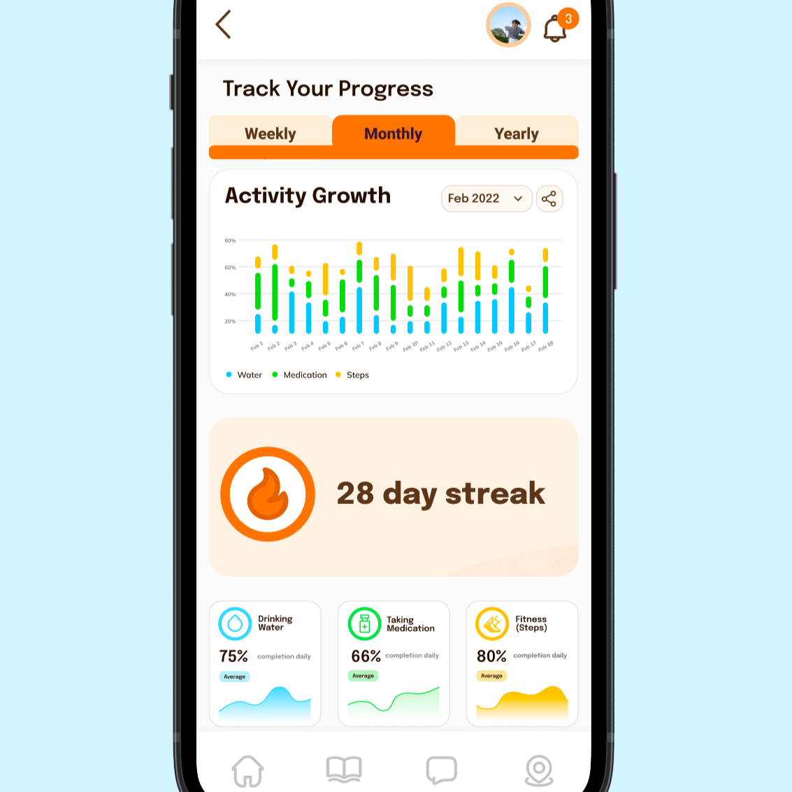
Habit tracker changes: I moved the in-depth graph view out of the navigation bar, as it was deemed a lower-priority function for the majority of users. I also added a section to share their achievements, as many people said they'd like to share their progress with others.
Feedback on the habit tracker and resource library was mostly positive, and I was able to improve the designs to address concerns and gaps that were identified.
Primary features
Getting access to useful and relevant information can be difficult. Providing a library with verified articles can help create a trustworthy hub for people to search for advice. Providing different options for users to absorb the content makes it more accessible for those who need it.
Easily access resources

Visualising progress for the mundane daily tasks can help encourage users and make completing them just a bit more fun. Collecting this data and compiling it can allow users to understand the impact these habits have in the long-term, and see how far they've come.
Track daily habits

Local spots: Users wanted to be able to share and find local spots -- hiking trails, helpful clinics, etc. -- so that they can find specialised locations in their area.
Goal reminders: Users wanted the option to get sent push notifications on their goals periodically so they don't forget.
Community corner: Users wanted a place where they could connect with other people with similar goals and hobbies to help hold each other accountable.
In workshops, three main features kept being requested:
Added features


This app was fun to work on, and the project team received a lot of positive feedback on the idea. Access to mental health support and advice can be difficult to access for a variety of reasons, even in apps that are meant to help.
There is often an intersectionality to the concerns that people have. Whether it's mental disorders, physical disabilities, or just difficult moments in life, everyone needs help at some point.
Many more features were brought up in brainstorming sessions and user testing that I would've loved to explore, but due to time constraints, we were unable to. Smart watch compatibility, connection to other health apps -- this concept can go so much further and reach many more people.